Southwest Airlines’ New Homepage Design Fails on User Experience
Large images are visually appealing, but they can harm the overall user experience if they aren’t appropriately prioritized.
Full extract (ppt) and video of the Google Hangout presentation of the Google’s 2014 Traveler’s Road To Decision Study made in collaboration with Ipsos MediaCT. Google – The 2014 Traveler’s Road To Decision from Francesco Canzoniere Here a quick recap of the most important insights: – 76% of leisure travelers select an OTA for its lower …
Source: blog.kissmetrics.com
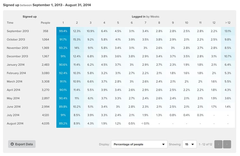
Focus on running tests to identify the variables that do impact your audience. Start with using the funnel report to tell us how our website converts for a specific date range and then use cohort analysis (a cohort is a group of people who share a common characteristic or experience within a particular time span) in order to track how each group’s behavior changes over time.
The psychology of color as it relates to persuasion is one of the most interesting — and most controversial — aspects of marketing. To alleviate this trend and give proper treatment to a truly fascinating element of human behavior, we’ve reviewed a…
Source: www.huffingtonpost.com
Often-cited examples of a boost in conversions due to a change in button color, mislead people because a conversions level uplift after changing a button from green to red, for instance, do not prove any magic power of one color over another.
The reason why a change in a button color can boost conversions is due to the contrast that it creates, the so called “isolation effect”, which is needed to get high conversions.
Generate this isolation effect when testing color palettes, in order to create contrast in your web design and guide people to important action areas.