Usability

When Do You Need a Long-Form Sales Page?

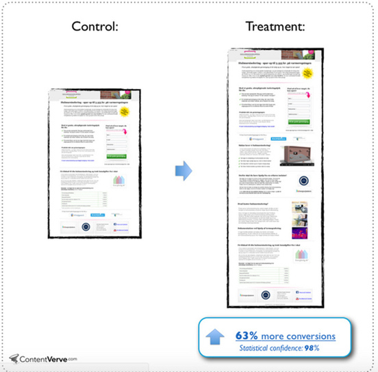
You want to include *just enough* information on your landing page to close the sale. So how do you know when you need a long-form sales page?

Source: unbounce.com

Take a look at your sales page and take some time to:

  1. Determine if going long-form is the right call. Depending on the particulars of your offer and how aware your prospects are of their problem and the solution, keeping it concise may be exactly what the doctor ordered.
  2. See if your page is suffering from any of the common mistakes cited above. If it is, take the time to rework your design or copy.
  3. A/B test a longer version against a shorter version. No matter how much we’d all love for there to be tried and true best practices, there simply aren’t any. You’ve got to test for yourself.

When Do You Need a Long-Form Sales Page? Read More »
The Psychology of Color in Marketing and Branding

The psychology of color as it relates to persuasion is one of the most interesting — and most controversial — aspects of marketing. To alleviate this trend and give proper treatment to a truly fascinating element of human behavior, we’ve reviewed a…

Source: www.huffingtonpost.com

Often-cited examples of a boost in conversions due to a change in button color, mislead people because a conversions level uplift after changing a button from green to red, for instance, do not prove any magic power of one color over another.
The reason why a change in a button color can boost conversions is due to the contrast that it creates, the so called “isolation effect”, which is needed to get high conversions.
Generate this isolation effect when testing color palettes, in order to create contrast in your web design and guide people to important action areas.

The Psychology of Color in Marketing and Branding Read More »

Scroll to Top